Please rotate phone

Simply Self Storage
Brand Identity, Visual Design and Packaging
In a competitive market where national storage brands were rapidly modernizing, Simply Self Storage recognized the need for a complete rebrand. Their existing brand, over 15 years old, felt outdated and lacked the visual strength to compete. They engaged Ruckus to create a fresh, modern identity, including a new logo, brand guidelines, signage, uniforms, and messaging—all while maintaining their existing color palette. The challenge was to revamp over 200 retail locations without repainting or making extensive structural changes, ensuring a seamless transition that felt both new and familiar.

Client:
Simply Self Storage
Year:
2016-2017
Role:
Creative Director
Package Designer
Visual Designer
Brand Identity
Website, UX/UI Designer
Agency:
Ruckus
My Role
I led all creative efforts in developing the new brand identity and played a key role in field research. Over several weekends, I visited Simply Self Storage locations across the Northeast, from the newest and best-maintained facilities to those that were struggling. By speaking directly with location owners, I gained valuable insight into what they loved about the brand, what needed improvement, and how they envisioned its future. These conversations helped shape our creative brief and provided a strong foundation for the rebrand.
The Challenge
The primary challenge was modernizing the brand without making drastic structural changes to individual locations. Since each Simply Self Storage facility was privately owned but operated under a franchise-like model, any branding updates needed to be easy to implement across the board. Additionally, safety and security were the top concerns for customers selecting a storage facility, so the new branding had to reinforce trust, comfort, and reliability. The logo needed to be modern, unique, and instantly recognizable—something that visually communicated what the company does while remaining simple and versatile across all marketing materials.
The Solution
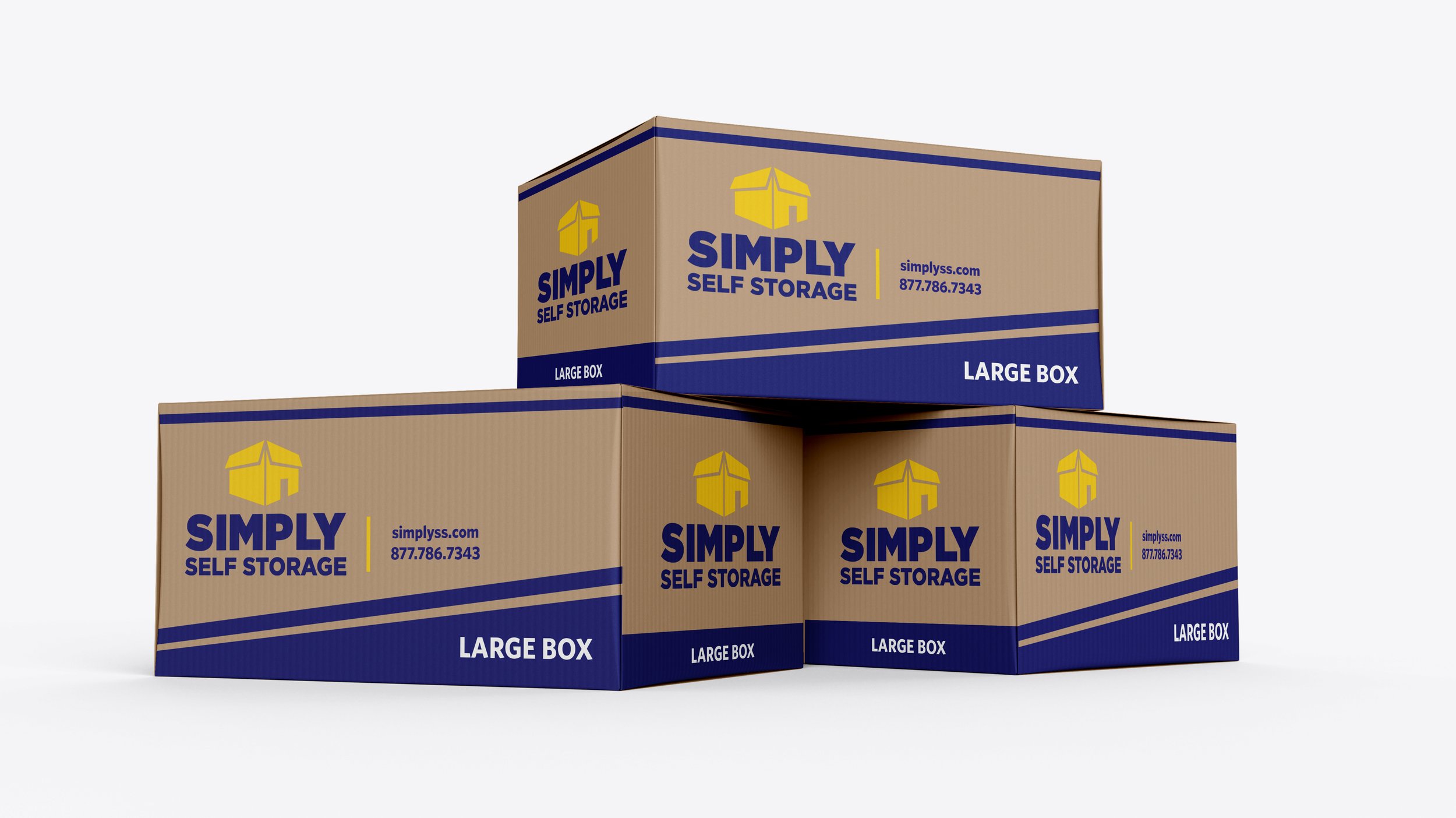
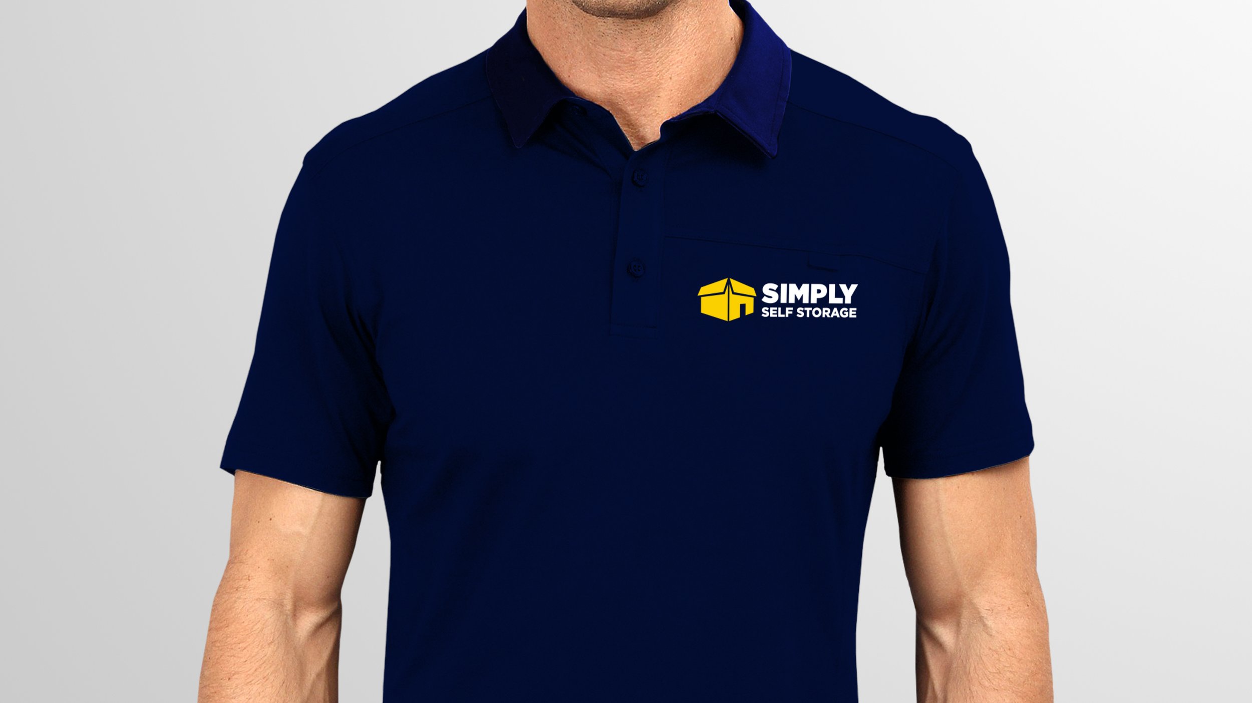
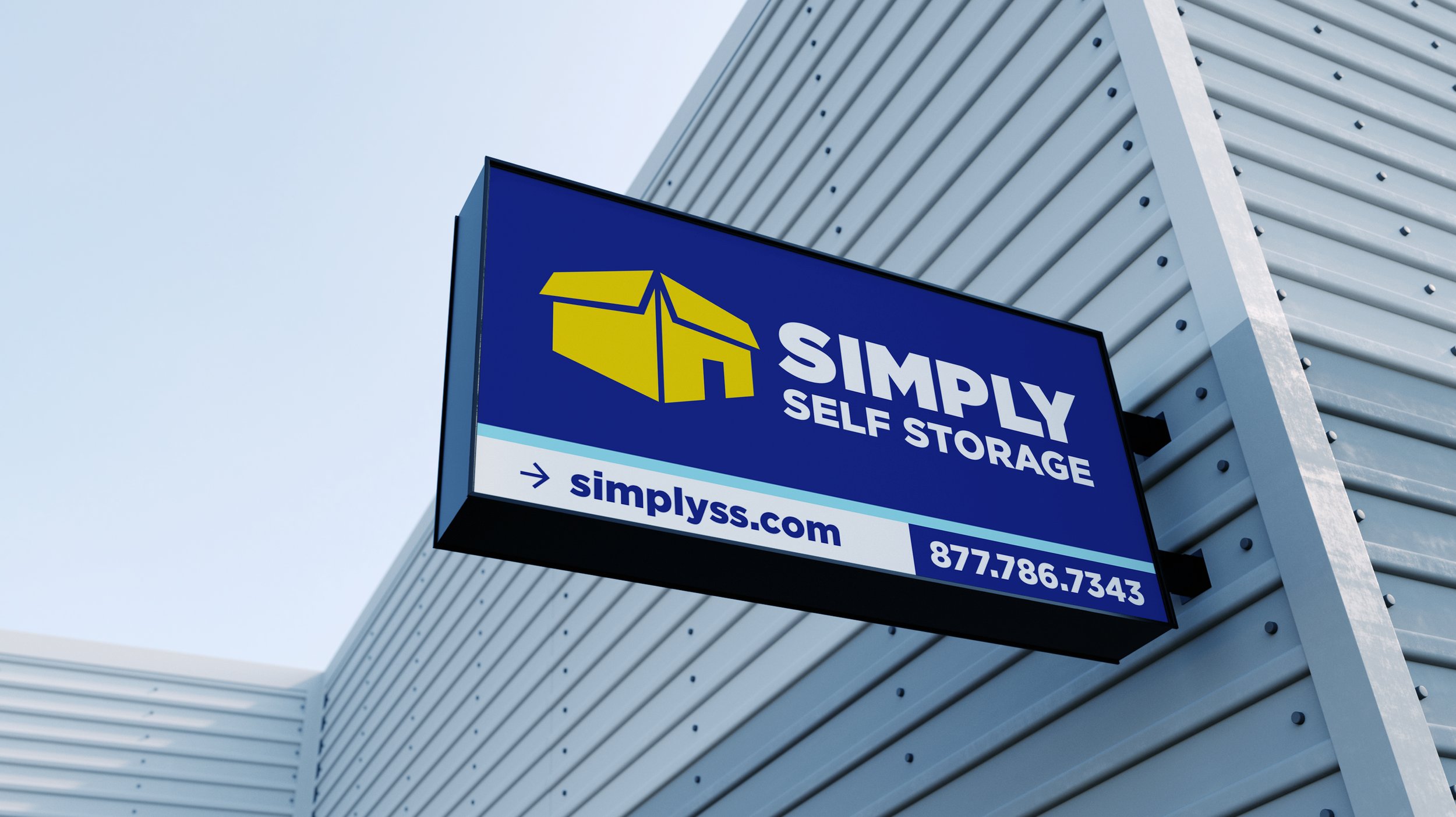
Using insights from our field research, we developed a bold, modern logo that balanced simplicity with functionality. The new icon resembled both a storage box and a building, making it instantly recognizable and adaptable across various materials. To complement the logo, we selected a clean, modern sans-serif typeface that was bold, legible, and professional.
Beyond the logo, we designed new uniforms, hats, moving box packaging, and updated signage, ensuring a cohesive look across all locations. To guarantee consistency, we compiled everything into a comprehensive set of brand guidelines, providing corporate and individual owners with clear instructions on how to implement the new branding effectively.
The Results & Accomplishments
Immediate Adoption – Simply Self Storage was thrilled with the new branding and wasted no time in rolling it out. Within days of receiving the final logo files, the corporate office in Florida had already updated all their signage.
Positive Reception – Individual location owners enthusiastically embraced the rebrand, noting an immediate boost in morale and a renewed sense of pride in their business. The new branding set a higher standard for the company, reinforcing its position as a modern and trustworthy storage provider.
Industry Recognition – The Simply Self Storage rebrand was a resounding success, earning two prestigious awards in 2017:
Silver Davey Award for Integrated Campaign – Promotional/Branding
Platinum Summit International Award for Marketing Effectiveness – Corporate Branding


— Joe Robinson, Executive Vice President, Simply Self Storage
"When we were going through the creative process, the one thing that really impressed me about Ruckus was their perseverance throughout the creative process. At the end of the day, our new logo tells a strong story for the customer. Our brand statement is all about creating a safe place for people to store their belongings and making them feel welcome."